• Skip to primary navigation
  • Skip to content
  • Skip to primary sidebar

Simplicity Rules

Adam DuVander on keeping it simple

  • About Adam

Stop Fishing at the Popular Spots

March 21, 2014 by Adam DuVander

I’m not much of a fisherman, but I go out with my friend Steve every couple years. We usually walk along the river, looking for the bends, where the water gets calm. The first couple spots are usually taken by others casting their flies. The next couple of spots Steve often walks right by, because they’ve likely been fished by others too lazy to hike in a little farther.

Fishermen at sunset

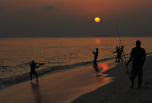
Even if you don’t fish, this likely makes some sense to you. As a Portlander who likes breakfast, I know going to a less crowded restaurant gives me a greater chance of having a seat for my salmon hash.

Another story of a fisherman takes a less obvious approach to choosing the less popular spots. It’s not about where you get the fish, but what you do with it afterward:

After his first few hauls of fish, John did something quite significant. He bucked an industry trend that had lasted for decades. Instead of doing what all the other fishermen did, which was to sell his fish to a distributor, John went direct to the biggest fish buyers in town: the tourist-packed seafood restaurants on the Cape’s famous Atlantic Seaboard.

After knocking on a few doors, John quickly realized that the restaurant owners were only too pleased to hear from him. After 50 years of being at the mercy of the centralized resellers, John’s service – fresh fish, straight off the boat – was exactly what they’d been waiting for.

I love this story, Fresh Fish, from the eBook Do Ideas. It simply questions an assumption that all other fishermen are making.

What’s the equivalent of the distributor for you in this story? What if that were not as important as you think?

Photo by Mohamed Malik

How to Show Just Enough Data

February 10, 2014 by Adam DuVander

I love tracking my activity. I’ve been using a pedometer of some sort for almost five years. I even created units for distances I had measured in steps. Now that wearable computing is an accepted trend, I’m excited for our future. There’s one potential downside to devices collecting and presenting data to us—it’s easy to try to show too much. As a result of that downside, it’s tempting to show absolutely no data as an overreaction. This post is about one device that is showing just enough.

There are at least two personal use cases to retrieving data from a tracking device. One is to immerse myself in my own data. That is the navel-gazing use case and for that I should have as much data as possible. The promise of tracking devices is that they change habits. For that, you need data that inspires action. Much less data is needed for that use case.

Fitbit flexOver the years I have tried several different Fitbit tracking devices. I loved the original Fitbit that could clip on to things, but I lost a couple of them because they could also clip off of things. The Fitbit Flex has become my everyday tracker now. It’s a wristband with a clear slot window on the top. The actual device slips into the wristband and displays five LEDs through the window as the entire interface.

I thought I would miss being able to check in on my exact step count and other data throughout the day. In truth, it greatly has simplified my experience with tracking. Here’s how the LEDs work:

  • Your step goal is split into five segments
  • Tap twice on the device to see your progress
  • The number of solid LEDs are the segments you have completed
  • The blinking LED represents the segment you are currently working toward

If you’re gunning for 10,000 steps per day, the math here is pretty simple. Each segment represents 2,000 steps. If you have a different goal, it’s harder to translate into a step count.

But here’s the kicker: I have learned that is okay.

Knowing my exact step count is not nearly as important as knowing approximately how close I am to my goal. For example: if it’s into the afternoon and the fourth LED is neither solid nor blinking, I probably should go for a short walk. It’s showing me just enough data to make a decision.

Fitbit provides a way to get at that additional information, through syncing with my smartphone or computer. But that’s more for navel-gazing than taking action.

Syncing for Data, More or Less

There are devices with more—and less—data feedback on the device. The Fitbit Force now has a step count (and a watch, but I hear it’s bulky). I expect that we’ll see some attempts at wearables that give us way too much data. And there will be devices that rely entirely on syncing with another device to show feedback. That has its own set of problems.

My friend Aaron Parecki wrote a post about the wearable tracker syncing problem. There are many different methods that devices with varied displays use. There seems to be some kind of drawback for each, along with a healthy dose of bugginess. The tradeoffs of battery power (of the tracking device and the syncing device), frequency and required user intervention all impact how well syncing performs on today’s devices.

The sync is likely the long-term solution, especially with semi-permanent displays like Google Glass. But even then there’s a need to prioritize certain data for the action-oriented use case. When I’m navel-gazing, I want as much data as possible. When I’m checking in throughout the day, I want to see my progress. In this case, I believe devices should show just enough to get a feel for how I’m doing.

It turns out, five LEDs can suffice. What would you do with a few good constraints?

6 Productive Time-Boxing Techniques

February 3, 2014 by Adam DuVander

Over the years I’ve written many posts about productivity. For starters, it’s a topic that interests me, because I’m always looking to get more out of less (part of why I love Fancy Hands). Also, the tricks to be more productive are usually very simple to apply–and I think Simplicity Rules!

The most common and effective techniques for productivity involve some form of time-boxing, artificial constraints that help you focus on what is important. Though I had been practicing variations of time-boxing, I first heard the term in this Adaptive Path article about designers and chefs.

Here are six ways you can being productive with time-boxing.

POWER HOUR

“Yes, the capitalization is necessary,” I wrote about my POWER HOUR technique in 2005. I felt like uppercase helped explain the power in the simple process:
Eliminate the distractions of email, instant messaging, phones, radio and anything else that will take your attention. Then work on one project for 60 minutes.

Lately I have found tackling my POWER HOUR first thing in the morning works best for me. I don’t even have the distraction of someone else’s priorities in my head from reading email. More often than not, I spend this hour writing now, because that’s one of my highest-valued tasks.

What will you do in your POWER HOUR?

60 Second Deadlines

Which features are essential and nice-to-have?

If you don’t have an hour, how about a minute? This technique comes from my series on Designing the Obvious. Robert Hoekman, Jr., suggests taking 60 seconds to discover what is essential to a project:

“The project timeline has been cut in half. We have about 60 seconds to decide what to keep and what to throw away before we meet with the client in the conference room.”

Use this technique when you have a big project and want to get to something that is good enough. From your giant list of features, cross out things that aren’t absolutely essential.

Two Minute Rule

If you have more than 60 seconds, try the trick to get anything done in two minutes. That’s perhaps over-stated, but it plays on the reality that you can never do something you don’t start.

There are two parts to the two minute rule:

  1. If something can be done in two minutes, do it
  2. If something takes more than two minutes, start it

The Two Minute Rule comes from James Clear on Quora. It’s helped me jam through to-do lists by making just enough progress to have a better view of what to do next.

Pomodoro Technique

This one has its own website. The Pomodoro Technique is a way of scheduling an entire block of productive time.

Pomodoro technique

Work heads down on a specific task for 25 minutes, then take a short break. Then do another “pomodoro,” the 25 minute timed work session. Every four pomodoros, take a longer break, 20 or 30 minutes.

Sometimes I’ll use a variation of this technique on with the Vitamin R application on my Mac. It helps you set what it calls “time slices” and even hides distracting apps from your view.

Four Day Work Week

Don’t confuse this with the more-hyped Four Hour Work Week. While more realistic, my guess is most people don’t see this one as very achievable, either. But the idea is sound because it builds in constraints:

The problem wasn’t a time issue, it was a mental issue. I knew I had a whole week to finish my work, so I spread it out over five (or seven!) days. If I knew I only had four days to finish a whole week of work, it would’ve motivated me to get things done more efficiently.

Ryan Carson, who originated this idea, has made it a part of the culture of two companies. His latest, Treehouse has raised 4.75 million and still closes up its office (in Portland!) on Thursday.

Workstation Popcorn

This final technique is new to me and I haven’t actively tried it yet. But I think I have found myself naturally gravitating toward something similar when I look for a new work spot to change my perspective.

Workstation Popcorn says to group your tasks into three roughly equal time chunks. Then, work from a different coffee shop or cafe for each of those chunks. You focus only on the group of tasks you’ve set aside for that location.

Using this and other time-boxing techniques, you can get the important things done in less time. Which one will you try first?

Get Better By Doing More

January 27, 2014 by Adam DuVander

We all know that to get really good at something requires practice. The popular notion is that it takes 10,000 hours to master something. In my experience, it takes considerably less time to become noticeably better. And noticeably better is good enough for most people. It turns out that quantity and quality are not always at odds. In fact, with practice–quantity–one can achieve quality. My favorite story of this principle comes from art.

Ball of clay

It’s said that an art teacher split his class into two segments at the beginning of the semester:

  1. One group of students would be graded on the number of art pieces each created, without respect for whether the art was any good.
  2. The other group would have one project upon which the entire grade would be based.

At the end of the semester, the students with the best work were the ones who created the most art. Quantity produced quality.

Bowls of clayI’m not sure where I first heard this story, though I recently saw it cited here. And I’m also not sure if the story is true, but the lesson it shares is important. It’s changed how I approach creative work.

Writing a book

When I struggled to write a 300 page book, I took to blogging at ProgrammableWeb to flex my sprinting muscles. Each day I started by writing a blog post. Since I was being paid per post and had a big book to write, I would blog as quickly as possible. After a couple weeks of this five posts per week pace, I realized the mentality had transferred to my book. No longer was I thinking of each section as something that would be forever in print, a daunting mental block. Each page of the book did not need to be a perfect gem, it just needed to be another page.

Writing a blog

My friend Fritz at Who2 had a similar issue, a common case of blogger’s block. The desire to make each post an opus was keeping him from writing posts at all. Then he just started writing. Sometimes he’d write short posts, just a few sentences long, but it was important that he was publishing posts. Just doing something develops the habit. Then the repetition makes you better. By the way, the Who2 blog is now really, really good, far surpassing “noticeably better.”

Making hit pop songs

It’s not just writing and clay, quantity can also create quality in other artistic endeavors. Take the BeeGees, who we now know for hits like Stayin’ Alive. They released 12 singles before getting on any charts, and that was just in Australia. Granted, there are plenty of stories of bands that never reach commercial success. But think about the effort that goes into recording and then releasing a dozen singles. That practice paid off.

Coding websites

Last year I happened upon a pretty cool student project called API a Day. Ali Fairhurst spent the month of January using a new API every day. APIs are ways websites can share data or functionality with other sites by making it available to programmers. I was keen to follow along, because Ali was living the principle of quantity. I touched base with her about halfway through and she said something interesting: She as finding the use cases of the APIs she chose too similar. She was getting bored.

Boredom may be the key to why quantity breeds quality. By doing more of the same thing, you yearn for something different. And since you’re bound to also be bored by something lesser you try something greater. Until that, too, becomes boring.

In far less than 10,000 hours you can become noticeably better at whatever you practice, simply by aiming for quantity over quality. What do you want to do better?

Photos by bptakoma

Seven Years Ago Today the iPhone Wasn’t That Great

January 9, 2014 by Adam DuVander

On January 9, 2007 Steve Jobs announced the iPhone. This device, and the other phones and tablets it has inspired, clearly changed the way many of us live our lives. At the time it was impressive technology, but there were many problems with it.

Original iPhone with 3G and 4
Photo by Yutaka Tsutano

To me, the most impressive thing about the last seven years is not that Apple created a whole new approach to smart phones. The company, known for its determination to get things right, was willing to release the iPhone before it was perfect… and has spent the last seven years practicing kaizen, incrementally improving the iPhone.

The original iPhone was too expensive

The cheapest iPhone cost $499 in 2007. The cost of the iPhone has continued to be an issue, but the original price was scary high at a time when most of us spent far less time with our phones. PCMag called it a revolution for the few, declaring the iPhone a niche product.

Now one can have a new iPhone for $99.

The connection was too slow

Though 3G connections were available on other smartphones, Apple launched the iPhone with an Edge connection. Those who already had fast data were unlikely to give it up.

It took another year for the iPhone 3G. Now Apple has fully caught up, first with 4G and now LTE.

Couldn’t copy and paste

What?! Despite introducing several new types of interfaces with the iPhone, there was no way to copy and paste text.

That took over two years to come.

No GPS

It took a long time for the iPhone to get turn-by-turn directions, but that wouldn’t have even worked on the original iPhone. The 2007 model used cell tower and WiFi triangulation to determine the placement of the blue dot on the map.

Attached to a single carrier

The first iPhone was only available on Cingular (later rebranded as AT&T). It is now available on a number of carriers world-wide.

Couldn’t download attachments

A non-starter for most business users:

Will the iPhone support Word, Excel and PowerPoint documents? Jobs says you can synchronize the iPhone with e-mail — and even pointed to IMAP support, including Microsoft Exchange — but what about attachments? Without support for standard office documents, the iPhone is a non-starter for most business users.

I rarely receive attachments that are useless to me these days. That’s perhaps helped by the next item.

No apps

Not much to say here. I barely remember life without apps.

In fact, I don’t remember much about my pre-iPhone life. I guess I used to phone in tasks to myself rather than add them to a to-do app. And I took photos with a camera?

My post about the iPhone in 2007 focused on the lack of a physical keyboard as a choice Apple made for simplicity. While that was seen as a negative by many at the time (“the letter keys are just pictures on the glass screen“), people got used to it. But many more issues with that original iPhone were short-term shortcomings.

There are many ways to be inspired by the iPhone as a product. The one I celebrate on the seventh anniversary of its launch is all the ways it’s been improved, a little at a time.

What can you launch even if it’s not perfect?

  • « Previous Page
  • Page 1
  • …
  • Page 3
  • Page 4
  • Page 5
  • Page 6
  • Page 7
  • …
  • Page 85
  • Next Page »

Simplicity Series

  • Designing the Obvious
  • Paradox of Choice
  • Laws of Simplicity

Copyright © 2023 · Elevate on Genesis Framework · WordPress · Log in